-
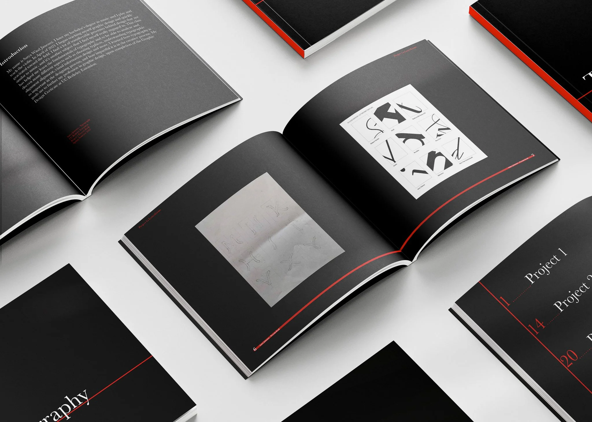
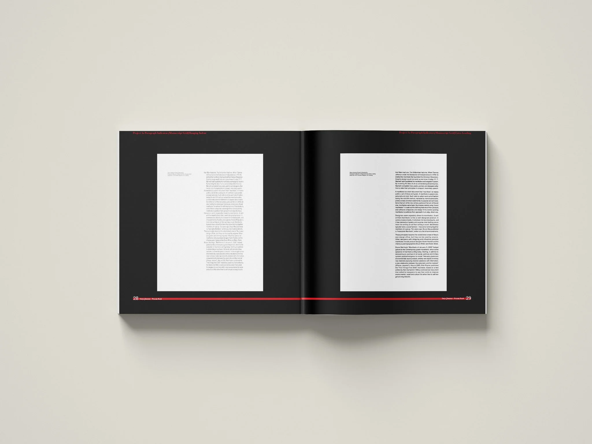
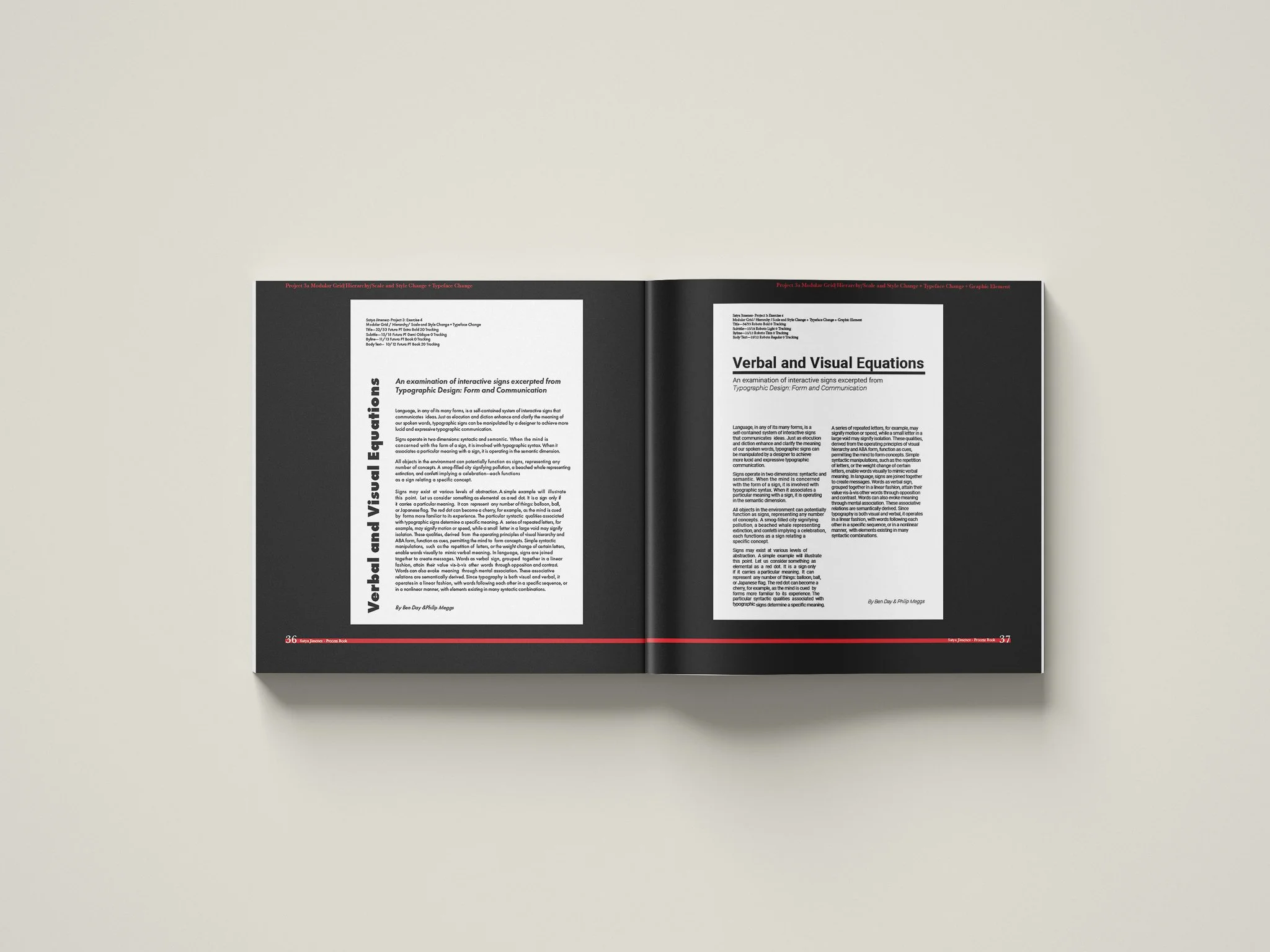
Create a book which showcases your work from the past semester. Create a concept and theme, and plan your layout using good design principles. Focus on: consistency in layout, color and photography, as well as judicious use of white space and balance in compositions. Do not let the design of your book distract from your work.
-
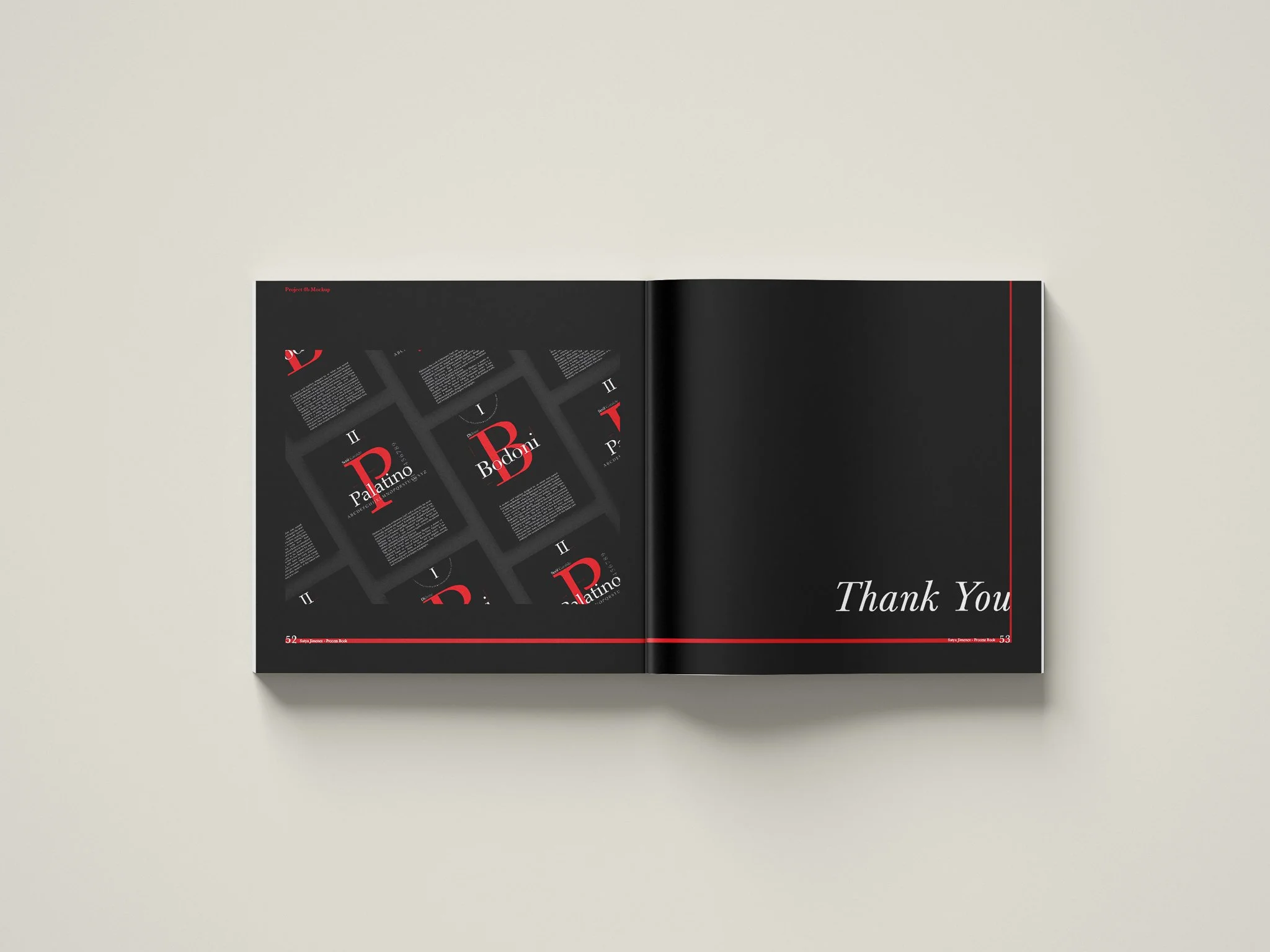
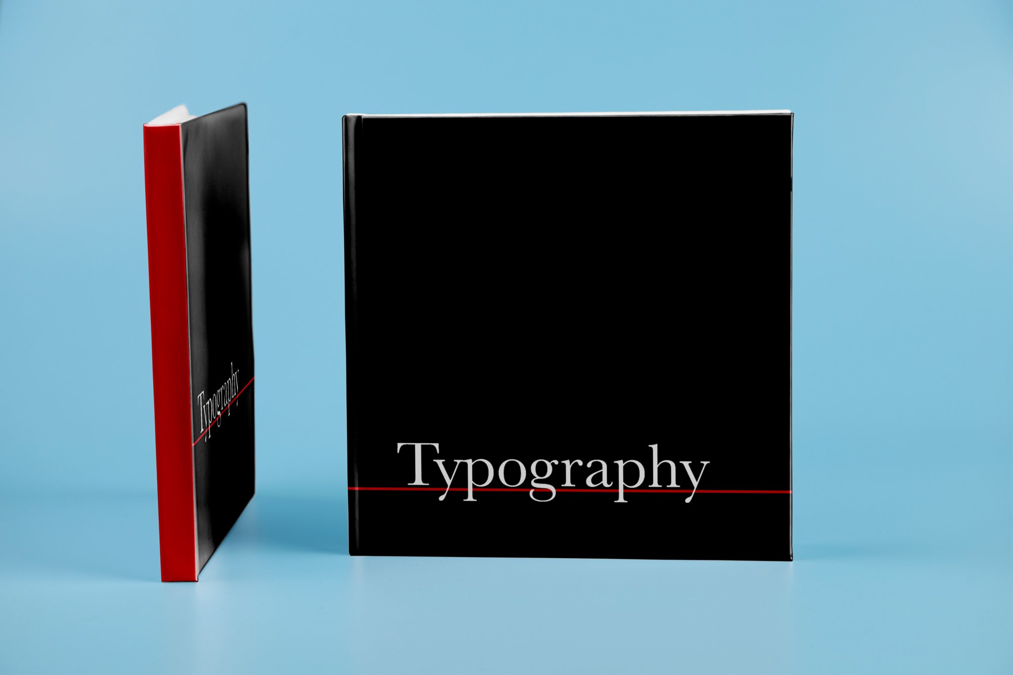
I was inspired to design this process book after learning about Swiss Designers, with the minimalistic style, color pallette, and general layout. Throughout the semester my projects had themes of Swiss elements, for instance the black, white and red colors throughout each project. I enjoyed thinking and learning about minimalistic approaches to design and I intended to create this book in this manner.
-
The general theme inspired by aesthetics of Swiss Design is portrayed, and is simple enough to really focus on the projects themselves. I chose to use Baskerville typeface for a more formal Serif print feel, which does contrast the heavily used Sans-Serif often used in Swiss Design. However, the simple layout and alignment along with the colors chosen still represent a similar character.
-
Adobe Illustrator, Adobe Photoshop, Adobe Indesign.
Typography Process Book - Class Project
Typography Process Book - Class Project
-
Create a book which showcases your work from the past semester. Create a concept and theme, and plan your layout using good design principles. Focus on: consistency in layout, color and photography, as well as judicious use of white space and balance in compositions. Do not let the design of your book distract from your work.
-
I was inspired to design this process book after learning about Swiss Designers, with the minimalistic style, color pallette, and general layout. Throughout the semester my projects had themes of Swiss elements, for instance the black, white and red colors throughout each project. I enjoyed thinking and learning about minimalistic approaches to design and I intended to create this book in this manner.
-
The general theme inspired by aesthetics of Swiss Design is portrayed, and is simple enough to really focus on the projects themselves. I chose to use Baskerville typeface for a more formal Serif print feel, which does contrast the heavily used Sans-Serif often used in Swiss Design. However, the simple layout and alignment along with the colors chosen still represent a similar character.
-
Adobe Illustrator, Adobe Photoshop, Adobe Indesign.

Inner Pages of Book
Inner Pages of Book
-
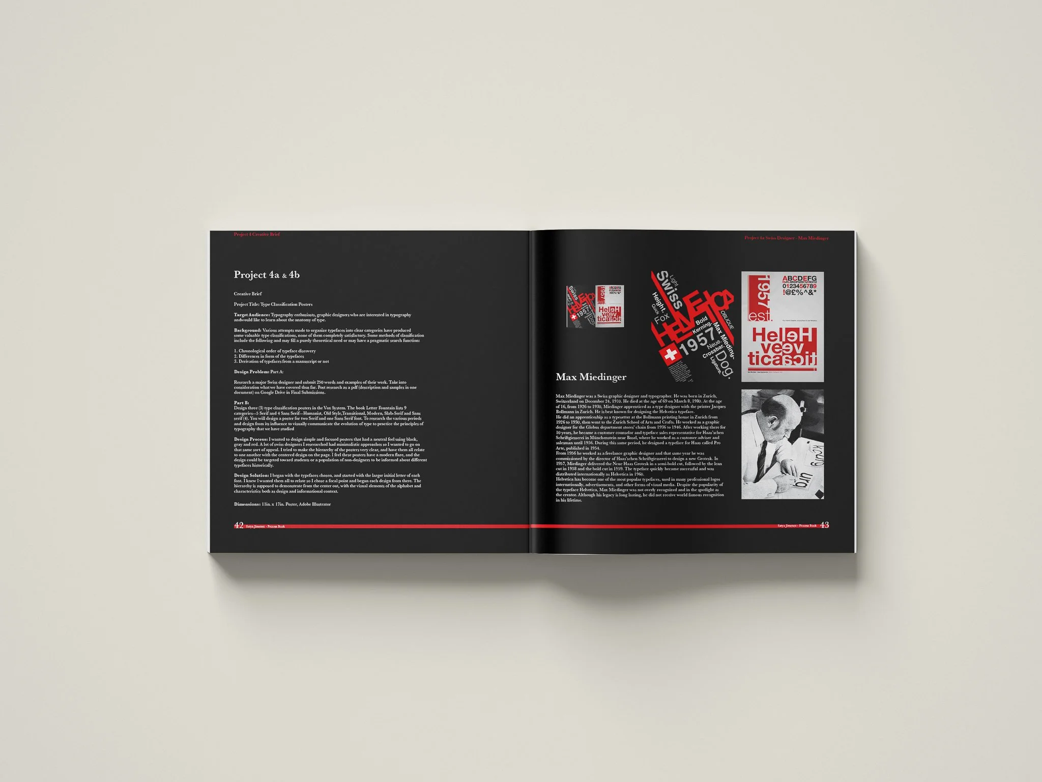
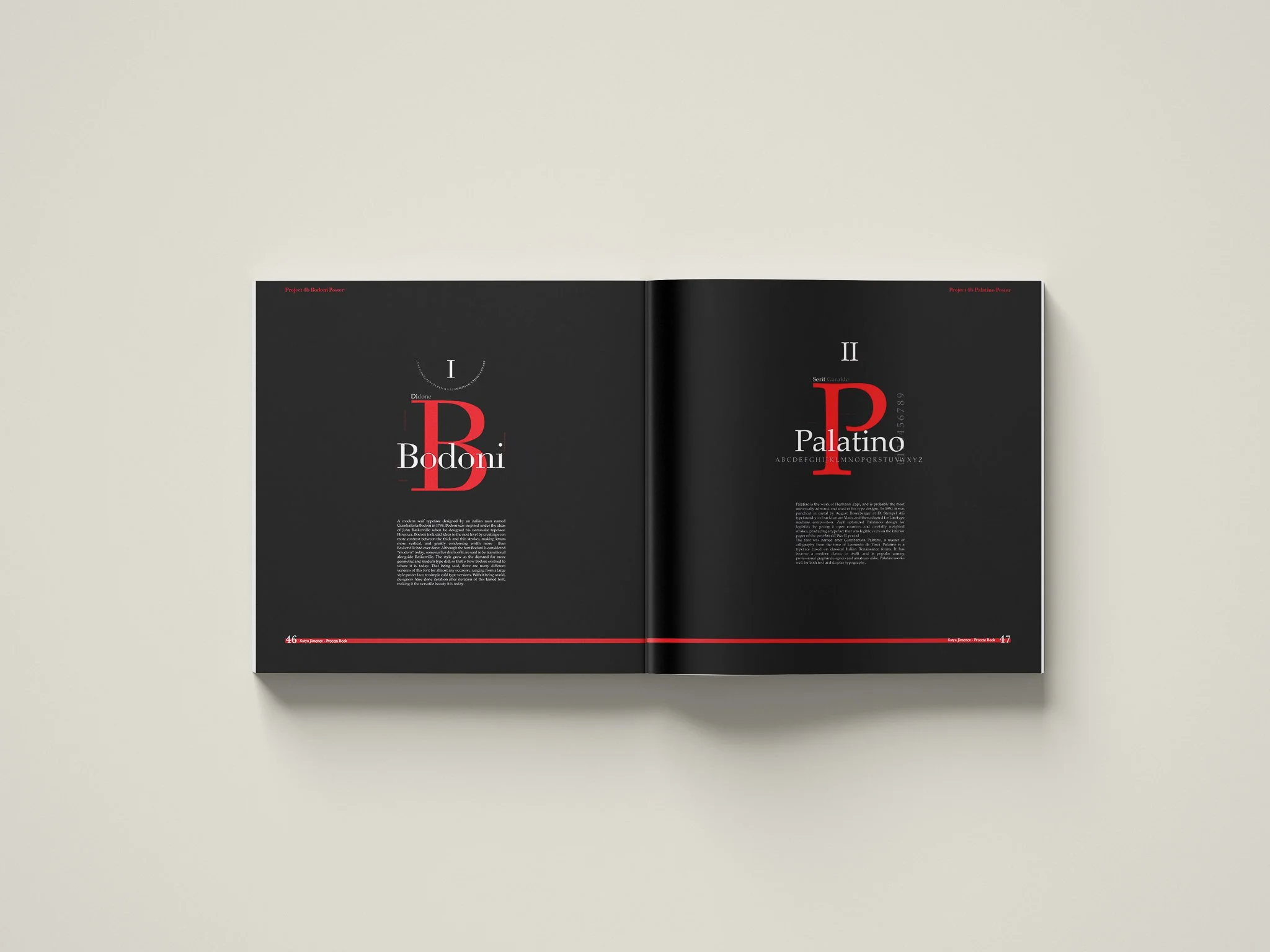
Design three (3) type classification posters in the Vox System. The book Letter Fountain lists 9 categories—5 Serif and 4 Sans Serif—Humanist, Old Style,Transitional, Modern, Slab-Serif and Sans serif (4). You will design a poster for two Serif and one Sans Serif font. To research the various periods and design from its influence to visually communicate the evolution of type to practice the principles of typography that we have studied
-
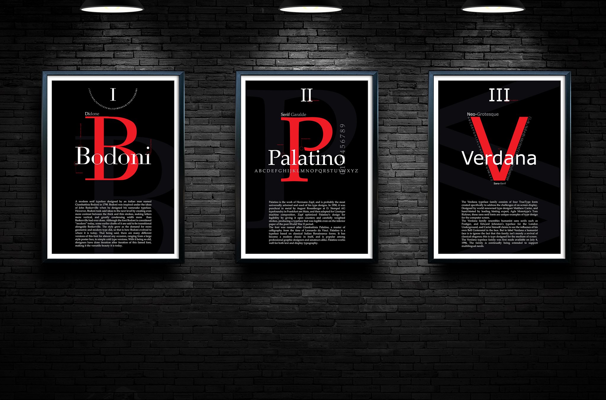
I wanted to design simple and focused posters that had a neutral feel using black, gray and red. A lot of swiss designers I researched had minimalistic approaches so I wanted to go on that same sort of appeal. I tried to make the hierarchy of the posters very clear, and have them all relate to one another with the centered design on the page. I feel these posters have a modern flare, and the design could be targeted toward students or a population of non-designers to be informed about different typefaces historically
-
I began with the typefaces chosen, and started with the larger initial letter of each font. I knew I wanted them all to relate so I chose a focal point and began each design from there. The hierarchy is supposed to demonstrate from the center out, with the visual elements of the alphabet and characteristics both as design and informational context.
-
Adobe Illustrator & Adobe Photoshop.
Typography Posters
Typography Posters
-
Design three (3) type classification posters in the Vox System. The book Letter Fountain lists 9 categories—5 Serif and 4 Sans Serif—Humanist, Old Style,Transitional, Modern, Slab-Serif and Sans serif (4). You will design a poster for two Serif and one Sans Serif font. To research the various periods and design from its influence to visually communicate the evolution of type to practice the principles of typography that we have studied
-
I wanted to design simple and focused posters that had a neutral feel using black, gray and red. A lot of swiss designers I researched had minimalistic approaches so I wanted to go on that same sort of appeal. I tried to make the hierarchy of the posters very clear, and have them all relate to one another with the centered design on the page. I feel these posters have a modern flare, and the design could be targeted toward students or a population of non-designers to be informed about different typefaces historically
-
I began with the typefaces chosen, and started with the larger initial letter of each font. I knew I wanted them all to relate so I chose a focal point and began each design from there. The hierarchy is supposed to demonstrate from the center out, with the visual elements of the alphabet and characteristics both as design and informational context.
-
Adobe Illustrator & Adobe Photoshop.


-
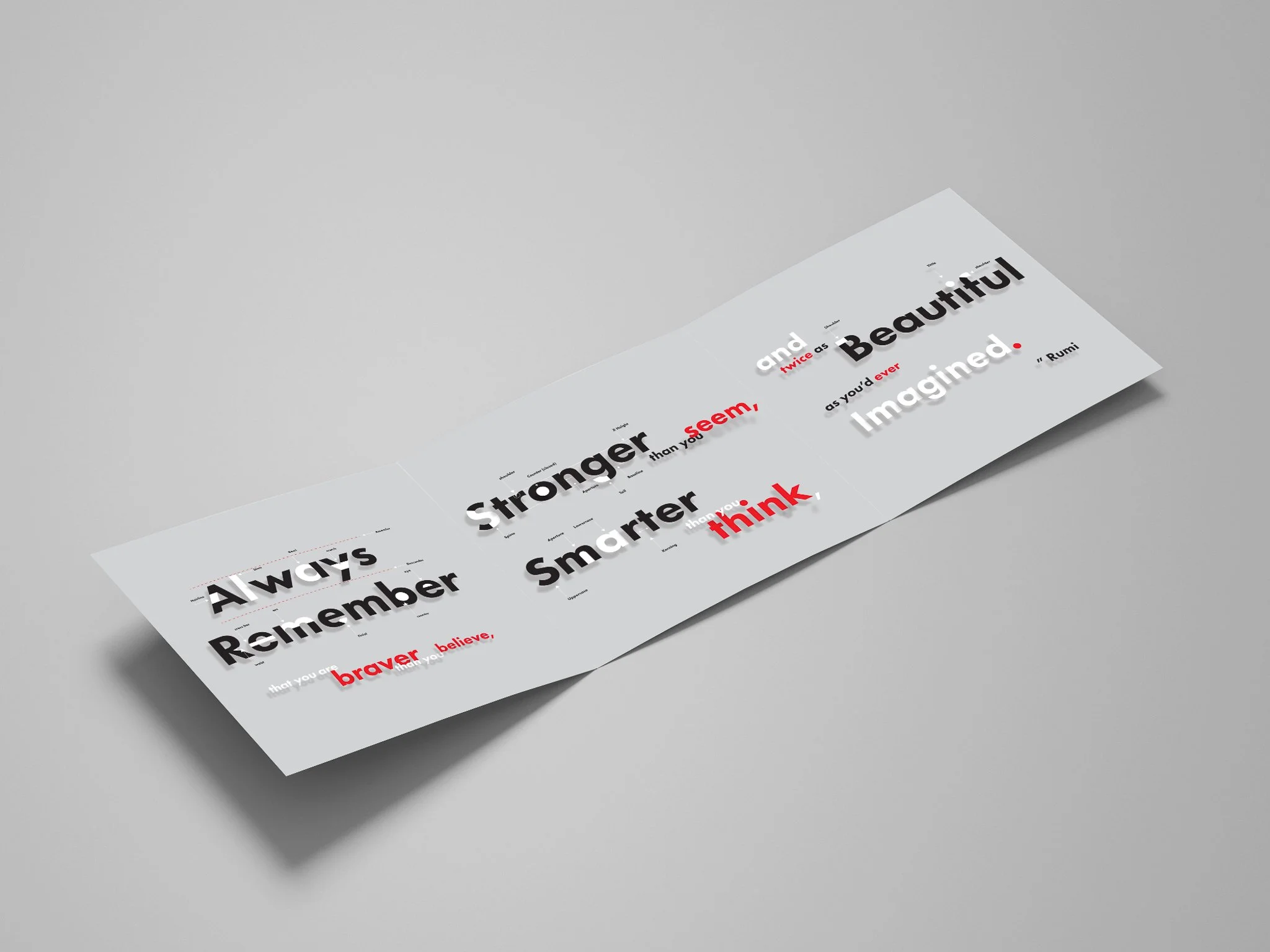
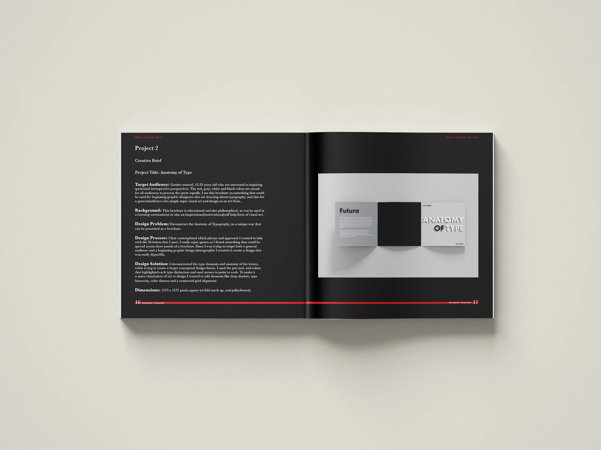
Introduce type terminology via an infographic with a focus on the target audience. Identify the structural aspects of type. Label the different kinds of strokes, junctions & negative spaces used to create letterforms. Identify a variety of differently shaped terminals and serifs. Increase awareness of letterforms and glyphs. Gain layout skills: hierarchy, negative space, focal point, color, and impact.
-
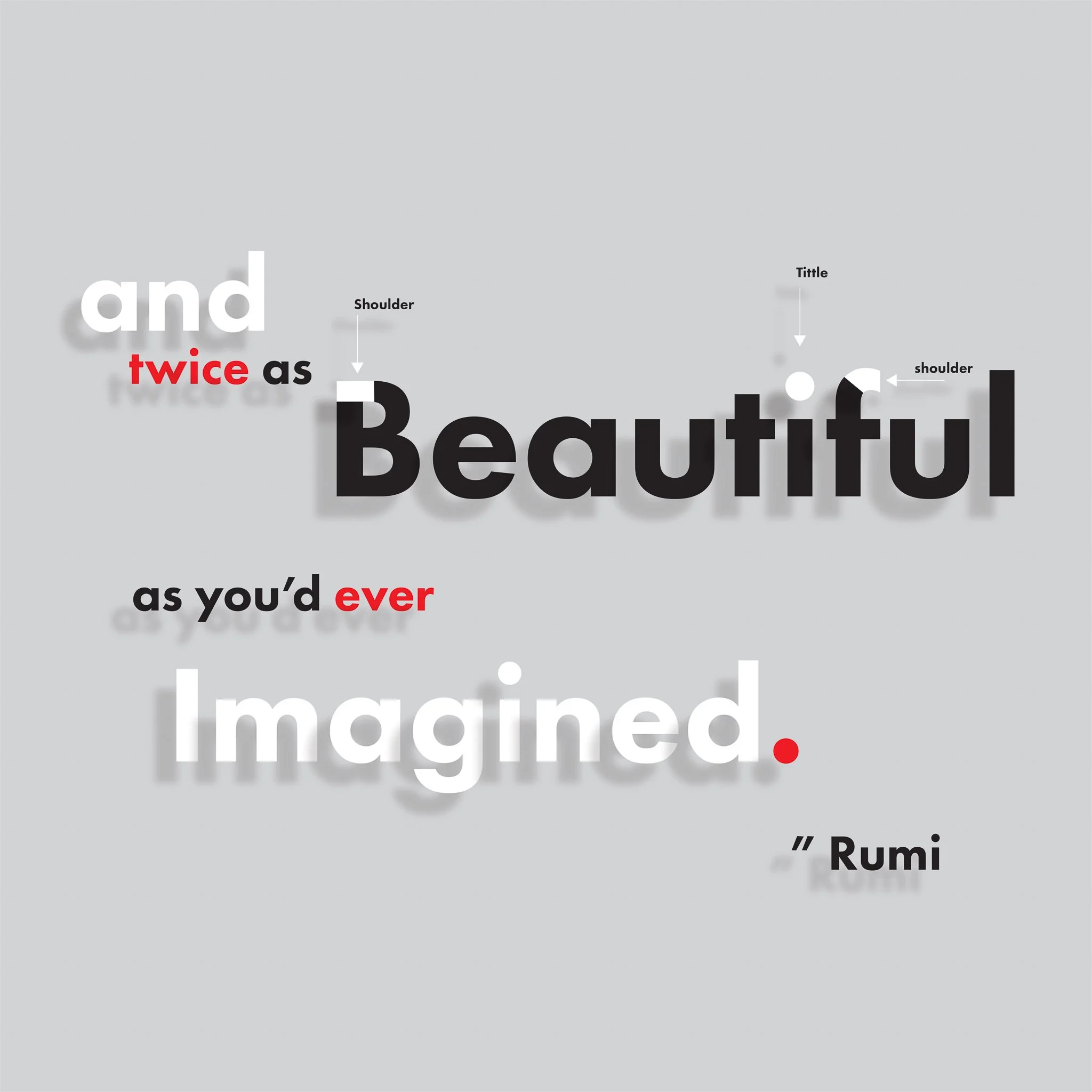
Deconstruct the Anatomy of Typography, in a unique way that can be presented as a brochure.
-
I first contemplated which phrase and approach I wanted to take with the 26 letters that I used. I really enjoy quotes so I found something that could be spread across three panels of a brochure. Since I was trying to target both a general audience and a beginning graphic design demographic I wanted to create a design that was easily digestible.
-
I deconstructed the type elements and anatomy of the letters, while trying to create a larger conceptual design theme. I used the pen tool, and colors that highlighted each type distinction and used arrows to point to each. To make it a more visual piece of art or design I wanted to add elements like drop shadow, type hierarchy, color themes and a connected grid alignment.
-
Gender neutral, 12-35 years old who are interested in inspiring quotes and introspective perspectives. The red, gray, white and black colors are meant for all audiences to process the quote equally. I see this brochure as something that could be used for beginning graphic designers who are learning about typography, and also for a general audience who simply enjoy visual art and design as an art form.
-
Adobe Illustrator & Adobe Photoshop
-
Introduce type terminology via an infographic with a focus on the target audience. Identify the structural aspects of type. Label the different kinds of strokes, junctions & negative spaces used to create letterforms. Identify a variety of differently shaped terminals and serifs. Increase awareness of letterforms and glyphs. Gain layout skills: hierarchy, negative space, focal point, color, and impact.
-
Deconstruct the Anatomy of Typography, in a unique way that can be presented as a brochure.
-
I first contemplated which phrase and approach I wanted to take with the 26 letters that I used. I really enjoy quotes so I found something that could be spread across three panels of a brochure. Since I was trying to target both a general audience and a beginning graphic design demographic I wanted to create a design that was easily digestible.
-
I deconstructed the type elements and anatomy of the letters, while trying to create a larger conceptual design theme. I used the pen tool, and colors that highlighted each type distinction and used arrows to point to each. To make it a more visual piece of art or design I wanted to add elements like drop shadow, type hierarchy, color themes and a connected grid alignment.
-
Gender neutral, 12-35 years old who are interested in inspiring quotes and introspective perspectives. The red, gray, white and black colors are meant for all audiences to process the quote equally. I see this brochure as something that could be used for beginning graphic designers who are learning about typography, and also for a general audience who simply enjoy visual art and design as an art form.
-
Adobe Illustrator & Adobe Photoshop
